- Details
- Written by Super User
- Category: Demo Info
- Hits: 16560

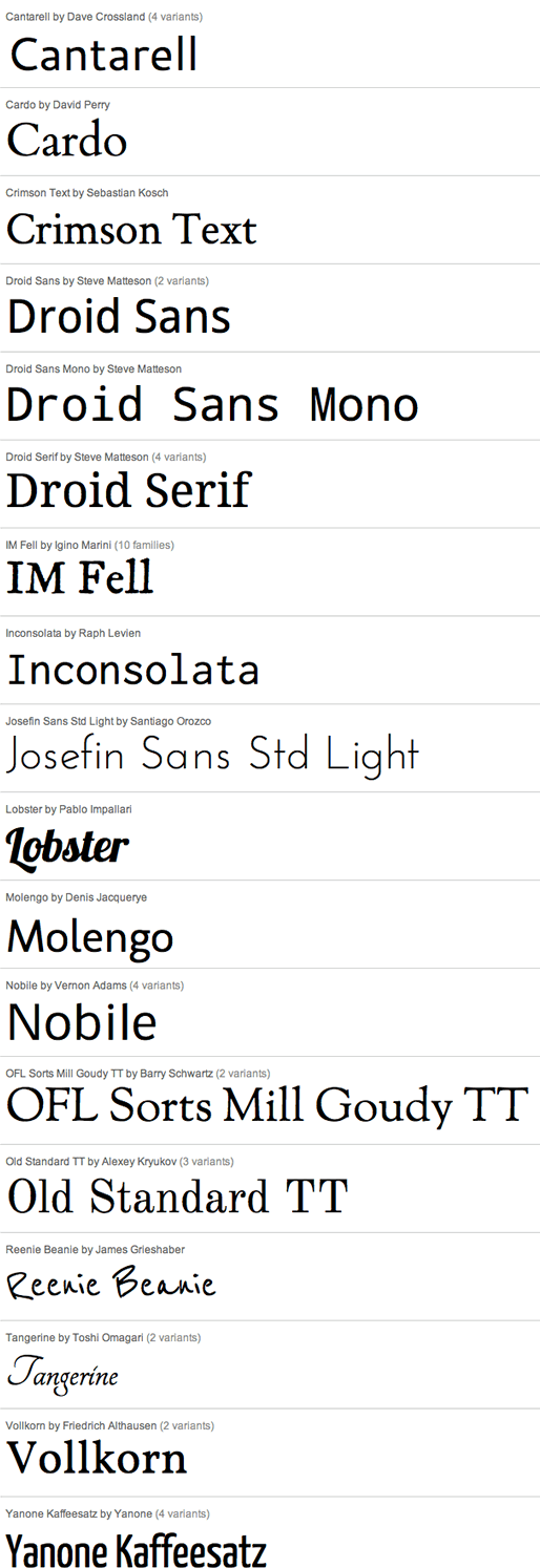
And many more!
- Details
- Written by Super User
- Category: Demo Info
- Hits: 16880
The following is a quick list of features:
- Change background to any hex color
- Change the border to any hex color
- Change the font to any hex color
- Set vertical position of each tab
- Set the height of each tab
- Set each tab to either the left or right of the screen
- Add a class to each fixed tab to enable s5 box or perhaps a lightbox or other 3rd party extension
- Add a URL to each fixed tab so onclick the URL loads
- Enter any text you desire
- Details
- Written by Super User
- Category: Demo Info
- Hits: 16292
- Details
- Written by Super User
- Category: Demo Info
- Hits: 14944
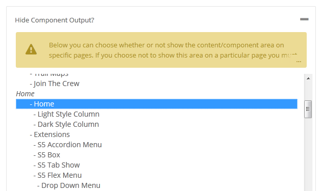
Below is a screenshot of this function from the configuration page, found under the Main / Layout tab under the field "Hide Component Output?" in the middle of the screen:
- Details
- Written by Super User
- Category: Demo Info
- Hits: 14990
Hide Sections of the Template via the Template Configuration
This is the simplest way to hide an area of the template is to use the template interface to easily select areas of the template that you want to hide on tablet sized screens (970px and less) or mobile screens (580px or less). Simply select the area that you want to hide and the Vertex framework takes care of the rest! These fields do work independent of each other, so if you want to hide something on both tablet and mobile sized screens you must select the same area on both fields.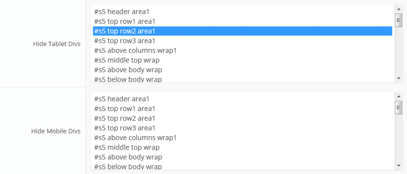
IMPORTANT - If you turn off a column position such as right or right_inset something else must be in the same column or the layout will not work. For example you can turn off right_inset and keep right, but you cannot turn off both unless something is publihsed to right_top or right_bottom as well.
Hide Specific Modules via the Hide Classes
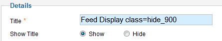
If you have only a specific module that you would like to hide at certain screen sizes, and not an entire section of the template, this is the best approach. A hide class is a class that can be applied to any element on the page and hides that particular element at certain screen sizes. Classes range in 100px increments for large screens and 50px increments for small screens. Below are some examples, and at the very bottom of this page there is a list of all the available hide classes. Use these sparingly if you can. As a recommendation, the primary target of these classes should focus on tablet and mobile sized screens. Wide screen monitors vary in size so it's much harder to use these classes correctly for large monitors. Tablet and mobile devices are much more consistent in size so it is much easier to apply the smaller hide classes.For example, say you want to hide a specific module when the screen sizes reaches 900px wide, and remain hidden for any screen below 900px. Simply add class=hide_900 to the title of the module like this:
The class is simply put into the title of the module. There must be a space just before class= , and don't worry, the class area of the title won't actually show on the live site, it's only shown in the backend. It must be entered exactly as shown above. The title can be published or unpublished, it does not matter which. Simply adding the classes to the title will apply the classes to the entire module.
What if you want it to hide the module only for a certain range? That's easy just add _only to the end of the class name. hide_900_only will only hide that element from 900px to the next increment in the hide classes, which is 850px. So it will only be hidden from 850px to 900px. You can also add multiple classes to the title like this class=hide_900_only hide_850_only which will apply both classes to the module.
What if you want to hide the module and then show it again later? That's simple, use show_ in the class instead of hide_. This will make the module show for the specified size no matter what other settings are on the module. So if you want to hide the module from 1000px and below, but you want to show it again later then do something like the following class=hide_1000 show_600. This will hide the module from 600px to 1000px.
Is there a more simple way? Yes, of course, the above directions are for experienced users who want to tweak their content for every available screen size. If you don't want to mess around with specific window sizes simply use the following classes instead, which have preset screen sizes applied to them:
hide_all
hide_wide_screen
hide_standard_screen
hide_large_tablet
hide_small_tablet
hide_mobile
show_wide_screen
show_standard_screen
show_large_tablet
show_small_tablet
show_mobile
Why would someone use hide_all? This is a great tool for anyone wanting to show content only on a mobile or tablet sized screen but hide it on all other devices. To do this you should use class="hide_all show_mobile". The hide_all will set the content or module to display:none on all devices, and one the screen size reaches mobile size the show_mobile will override the display:none and show the content.
Hide Specific Content via the Hide Classes
If you have only specific content or images within an article or module that you want to hide then use the same hide classes described above, but wrap that specific content inside of the class instead of applying it to the entire module. For example, in the image below, the third paragraph will hide at 900px and then show again at 700px.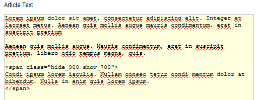
Available Hide Classes
All the available hide classes are listed below. Note there is a break at 970px and 580px to accommodate tablet and mobile sized screens. At the bottom of the list you will see inline calls, these calls should only be used if the default block calls cause a layout problem with your content, which can happen with applying a display:block./* HIDE CLASSES
----------------------------------------------------------- */
@media screen and (max-width: 1600px){
.hide_1600 {
display:none !important;
}
}
@media screen and (min-width:1500px) and (max-width: 1600px){
.hide_1600_only {
display:none !important;
}
}
@media screen and (max-width: 1550px){
.hide_1550 {
display:none !important;
}
}
@media screen and (min-width:1450px) and (max-width: 1550px){
.hide_1550_only {
display:none !important;
}
}
@media screen and (max-width: 1500px){
.hide_1500 {
display:none !important;
}
}
@media screen and (min-width:1400px) and (max-width: 1500px){
.hide_1500_only {
display:none !important;
}
}
@media screen and (max-width: 1450px){
.hide_1450 {
display:none !important;
}
}
@media screen and (min-width:1350px) and (max-width: 1450px){
.hide_1450_only {
display:none !important;
}
}
@media screen and (max-width: 1400px){
.hide_1400 {
display:none !important;
}
}
@media screen and (min-width:1300px) and (max-width: 1400px){
.hide_1400_only {
display:none !important;
}
}
@media screen and (max-width: 1350px){
.hide_1350 {
display:none !important;
}
}
@media screen and (min-width:1250px) and (max-width: 1350px){
.hide_1350_only {
display:none !important;
}
}
@media screen and (max-width: 1300px){
.hide_1300 {
display:none !important;
}
}
@media screen and (min-width:1200px) and (max-width: 1300px){
.hide_1300_only {
display:none !important;
}
}
@media screen and (max-width: 1250px){
.hide_1250 {
display:none !important;
}
}
@media screen and (min-width:1150px) and (max-width: 1250px){
.hide_1250_only {
display:none !important;
}
}
@media screen and (max-width: 1200px){
.hide_1200 {
display:none !important;
}
}
@media screen and (min-width:1100px) and (max-width: 1200px){
.hide_1200_only {
display:none !important;
}
}
@media screen and (max-width: 1150px){
.hide_1150 {
display:none !important;
}
}
@media screen and (min-width:1050px) and (max-width: 1150px){
.hide_1150_only {
display:none !important;
}
}
@media screen and (max-width: 1100px){
.hide_1100 {
display:none !important;
}
}
@media screen and (min-width:1000px) and (max-width: 1100px){
.hide_1100_only {
display:none !important;
}
}
@media screen and (max-width: 1050px){
.hide_1050 {
display:none !important;
}
}
@media screen and (min-width:950px) and (max-width: 1050px){
.hide_1050_only {
display:none !important;
}
}
@media screen and (max-width: 1000px){
.hide_1000 {
display:none !important;
}
}
@media screen and (min-width:900px) and (max-width: 1000px){
.hide_1000_only {
display:none !important;
}
}
@media screen and (max-width: 970px){
.hide_970 {
display:none !important;
}
}
@media screen and (min-width:900px) and (max-width: 970px){
.hide_970_only {
display:none !important;
}
}
@media screen and (max-width: 950px){
.hide_950 {
display:none !important;
}
}
@media screen and (min-width:900px) and (max-width: 950px){
.hide_950_only {
display:none !important;
}
}
@media screen and (max-width: 900px){
.hide_900 {
display:none !important;
}
}
@media screen and (min-width:850px) and (max-width: 900px){
.hide_900_only {
display:none !important;
}
}
@media screen and (max-width: 850px){
.hide_850 {
display:none !important;
}
}
@media screen and (min-width:800px) and (max-width: 850px){
.hide_850_only {
display:none !important;
}
}
@media screen and (max-width: 800px){
.hide_800 {
display:none !important;
}
}
@media screen and (min-width:750px) and (max-width: 800px){
.hide_800_only {
display:none !important;
}
}
@media screen and (max-width: 750px){
.hide_750 {
display:none !important;
}
}
@media screen and (min-width:700px) and (max-width: 750px){
.hide_750_only {
display:none !important;
}
}
@media screen and (max-width: 700px){
.hide_700 {
display:none !important;
}
}
@media screen and (min-width:650px) and (max-width: 700px){
.hide_700_only {
display:none !important;
}
}
@media screen and (max-width: 650px){
.hide_650 {
display:none !important;
}
}
@media screen and (min-width:600px) and (max-width: 650px){
.hide_650_only {
display:none !important;
}
}
@media screen and (max-width: 600px){
.hide_600 {
display:none !important;
}
}
@media screen and (min-width:580px) and (max-width: 600px){
.hide_600_only {
display:none !important;
}
}
@media screen and (max-width: 579px){
.hide_580 {
display:none !important;
}
}
@media screen and (min-width:550px) and (max-width: 579px){
.hide_580_only {
display:none !important;
}
}
.hide_all {
display:none ! important;
}
@media screen and (min-width:1300px) and (max-width: 50000px){
.hide_wide_screen {
display:none !important;
}
}
@media screen and (min-width:971px) and (max-width: 1299px){
.hide_standard_screen {
display:none !important;
}
}
@media screen and (min-width:750px) and (max-width: 970px){
.hide_large_tablet {
display:none !important;
}
}
@media screen and (min-width:580px) and (max-width: 750px){
.hide_small_tablet {
display:none !important;
}
}
@media screen and (min-width:580px) and (max-width: 750px){
.hide_small_tablet {
display:none !important;
}
}
@media screen and (max-width: 579px){
.hide_mobile {
display:none !important;
}
}
@media screen and (max-width: 1600px){
.show_1600 {
display:block !important;
}
}
@media screen and (min-width:1500px) and (max-width: 1600px){
.show_1600_only {
display:block !important;
}
}
@media screen and (max-width: 1550px){
.show_1550 {
display:block !important;
}
}
@media screen and (min-width:1450px) and (max-width: 1550px){
.show_1550_only {
display:block !important;
}
}
@media screen and (max-width: 1500px){
.show_1500 {
display:block !important;
}
}
@media screen and (min-width:1400px) and (max-width: 1500px){
.show_1500_only {
display:block !important;
}
}
@media screen and (max-width: 1450px){
.show_1450 {
display:block !important;
}
}
@media screen and (min-width:1350px) and (max-width: 1450px){
.show_1450_only {
display:block !important;
}
}
@media screen and (max-width: 1400px){
.show_1400 {
display:block !important;
}
}
@media screen and (min-width:1300px) and (max-width: 1400px){
.show_1400_only {
display:block !important;
}
}
@media screen and (max-width: 1350px){
.show_1350 {
display:block !important;
}
}
@media screen and (min-width:1250px) and (max-width: 1350px){
.show_1350_only {
display:block !important;
}
}
@media screen and (max-width: 1300px){
.show_1300 {
display:block !important;
}
}
@media screen and (min-width:1200px) and (max-width: 1300px){
.show_1300_only {
display:block !important;
}
}
@media screen and (max-width: 1250px){
.show_1250 {
display:block !important;
}
}
@media screen and (min-width:1150px) and (max-width: 1250px){
.show_1250_only {
display:block !important;
}
}
@media screen and (max-width: 1200px){
.show_1200 {
display:block !important;
}
}
@media screen and (min-width:1100px) and (max-width: 1200px){
.show_1200_only {
display:block !important;
}
}
@media screen and (max-width: 1150px){
.show_1150 {
display:block !important;
}
}
@media screen and (min-width:1050px) and (max-width: 1150px){
.show_1150_only {
display:block !important;
}
}
@media screen and (max-width: 1100px){
.show_1100 {
display:block !important;
}
}
@media screen and (min-width:1000px) and (max-width: 1100px){
.show_1100_only {
display:block !important;
}
}
@media screen and (max-width: 1050px){
.show_1050 {
display:block !important;
}
}
@media screen and (min-width:950px) and (max-width: 1050px){
.show_1050_only {
display:block !important;
}
}
@media screen and (max-width: 1000px){
.show_1000 {
display:block !important;
}
}
@media screen and (min-width:900px) and (max-width: 1000px){
.show_1000_only {
display:block !important;
}
}
@media screen and (max-width: 970px){
.show_970 {
display:block !important;
}
}
@media screen and (min-width:900px) and (max-width: 970px){
.show_970_only {
display:block !important;
}
}
@media screen and (max-width: 950px){
.show_950 {
display:block !important;
}
}
@media screen and (min-width:900px) and (max-width: 950px){
.show_950_only {
display:block !important;
}
}
@media screen and (max-width: 900px){
.show_900 {
display:block !important;
}
}
@media screen and (min-width:850px) and (max-width: 900px){
.show_900_only {
display:block !important;
}
}
@media screen and (max-width: 850px){
.show_850 {
display:block !important;
}
}
@media screen and (min-width:800px) and (max-width: 850px){
.show_850_only {
display:block !important;
}
}
@media screen and (max-width: 800px){
.show_800 {
display:block !important;
}
}
@media screen and (min-width:750px) and (max-width: 800px){
.show_800_only {
display:block !important;
}
}
@media screen and (max-width: 750px){
.show_750 {
display:block !important;
}
}
@media screen and (min-width:700px) and (max-width: 750px){
.show_750_only {
display:block !important;
}
}
@media screen and (max-width: 700px){
.show_700 {
display:block !important;
}
}
@media screen and (min-width:650px) and (max-width: 700px){
.show_700_only {
display:block !important;
}
}
@media screen and (max-width: 650px){
.show_650 {
display:block !important;
}
}
@media screen and (min-width:600px) and (max-width: 650px){
.show_650_only {
display:block !important;
}
}
@media screen and (max-width: 600px){
.show_600 {
display:block !important;
}
}
@media screen and (min-width:580px) and (max-width: 600px){
.show_600_only {
display:block !important;
}
}
@media screen and (max-width: 579px){
.show_580 {
display:block !important;
}
}
@media screen and (min-width:550px) and (max-width: 579px){
.show_580_only {
display:block !important;
}
}
@media screen and (min-width:1300px) and (max-width: 50000px){
.show_wide_screen {
display:block !important;
}
}
@media screen and (min-width:971px) and (max-width: 1299px){
.show_standard_screen {
display:block !important;
}
}
@media screen and (min-width:750px) and (max-width: 970px){
.show_large_tablet {
display:block !important;
}
}
@media screen and (min-width:580px) and (max-width: 750px){
.show_small_tablet {
display:block !important;
}
}
@media screen and (max-width: 579px){
.show_mobile {
display:block !important;
}
}
/* THE INLINE SHOW CALLS BELOW SHOULD BE USED SELDOMLY. THEY SHOULD ONLY BE USED
IF THE BLOCK SHOW CALLS ABOVE CAUSE A LAYOUT ISSUE WHEN TRIGGERED.
----------------------------------------------------------- */
@media screen and (max-width: 1600px){
.show_1600_inline {
display:inline !important;
}
}
@media screen and (min-width:1500px) and (max-width: 1600px){
.show_1600_only_inline {
display:inline !important;
}
}
@media screen and (max-width: 1550px){
.show_1550_inline {
display:inline !important;
}
}
@media screen and (min-width:1450px) and (max-width: 1550px){
.show_1550_only_inline {
display:inline !important;
}
}
@media screen and (max-width: 1500px){
.show_1500_inline {
display:inline !important;
}
}
@media screen and (min-width:1400px) and (max-width: 1500px){
.show_1500_only_inline {
display:inline !important;
}
}
@media screen and (max-width: 1450px){
.show_1450_inline {
display:inline !important;
}
}
@media screen and (min-width:1350px) and (max-width: 1450px){
.show_1450_only_inline {
display:inline !important;
}
}
@media screen and (max-width: 1400px){
.show_1400_inline {
display:inline !important;
}
}
@media screen and (min-width:1300px) and (max-width: 1400px){
.show_1400_only_inline {
display:inline !important;
}
}
@media screen and (max-width: 1350px){
.show_1350_inline {
display:inline !important;
}
}
@media screen and (min-width:1250px) and (max-width: 1350px){
.show_1350_only_inline {
display:inline !important;
}
}
@media screen and (max-width: 1300px){
.show_1300_inline {
display:inline !important;
}
}
@media screen and (min-width:1200px) and (max-width: 1300px){
.show_1300_only_inline {
display:inline !important;
}
}
@media screen and (max-width: 1250px){
.show_1250_inline {
display:inline !important;
}
}
@media screen and (min-width:1150px) and (max-width: 1250px){
.show_1250_only_inline {
display:inline !important;
}
}
@media screen and (max-width: 1200px){
.show_1200_inline {
display:inline !important;
}
}
@media screen and (min-width:1100px) and (max-width: 1200px){
.show_1200_only_inline {
display:inline !important;
}
}
@media screen and (max-width: 1150px){
.show_1150_inline {
display:inline !important;
}
}
@media screen and (min-width:1050px) and (max-width: 1150px){
.show_1150_only_inline {
display:inline !important;
}
}
@media screen and (max-width: 1100px){
.show_1100_inline {
display:inline !important;
}
}
@media screen and (min-width:1000px) and (max-width: 1100px){
.show_1100_only_inline {
display:inline !important;
}
}
@media screen and (max-width: 1050px){
.show_1050_inline {
display:inline !important;
}
}
@media screen and (min-width:950px) and (max-width: 1050px){
.show_1050_only_inline {
display:inline !important;
}
}
@media screen and (max-width: 1000px){
.show_1000_inline {
display:inline !important;
}
}
@media screen and (min-width:900px) and (max-width: 1000px){
.show_1000_only_inline {
display:inline !important;
}
}
@media screen and (max-width: 970px){
.show_970_inline {
display:inline !important;
}
}
@media screen and (min-width:900px) and (max-width: 970px){
.show_970_only_inline {
display:inline !important;
}
}
@media screen and (max-width: 950px){
.show_950_inline {
display:inline !important;
}
}
@media screen and (min-width:900px) and (max-width: 950px){
.show_950_only_inline {
display:inline !important;
}
}
@media screen and (max-width: 900px){
.show_900_inline {
display:inline !important;
}
}
@media screen and (min-width:850px) and (max-width: 900px){
.show_900_only_inline {
display:inline !important;
}
}
@media screen and (max-width: 850px){
.show_850_inline {
display:inline !important;
}
}
@media screen and (min-width:800px) and (max-width: 850px){
.show_850_only_inline {
display:inline !important;
}
}
@media screen and (max-width: 800px){
.show_800_inline {
display:inline !important;
}
}
@media screen and (min-width:750px) and (max-width: 800px){
.show_800_only_inline {
display:inline !important;
}
}
@media screen and (max-width: 750px){
.show_750_inline {
display:inline !important;
}
}
@media screen and (min-width:700px) and (max-width: 750px){
.show_750_only_inline {
display:inline !important;
}
}
@media screen and (max-width: 700px){
.show_700_inline {
display:inline !important;
}
}
@media screen and (min-width:650px) and (max-width: 700px){
.show_700_only_inline {
display:inline !important;
}
}
@media screen and (max-width: 650px){
.show_650_inline {
display:inline !important;
}
}
@media screen and (min-width:600px) and (max-width: 650px){
.show_650_only_inline {
display:inline !important;
}
}
@media screen and (max-width: 600px){
.show_600_inline {
display:inline !important;
}
}
@media screen and (min-width:580px) and (max-width: 600px){
.show_600_only_inline {
display:inline !important;
}
}
@media screen and (max-width: 579px){
.show_580_inline {
display:inline !important;
}
}
@media screen and (min-width:550px) and (max-width: 579px){
.show_580_only_inline {
display:inline !important;
}
}
@media screen and (min-width:1300px) and (max-width: 50000px){
.show_wide_screen_inline {
display:inline !important;
}
}
@media screen and (min-width:971px) and (max-width: 1299px){
.show_standard_screen_inline {
display:inline !important;
}
}
@media screen and (min-width:750px) and (max-width: 970px){
.show_large_tablet_inline {
display:inline !important;
}
}
@media screen and (min-width:580px) and (max-width: 750px){
.show_small_tablet_inline {
display:inline !important;
}
}
@media screen and (max-width: 579px){
.show_mobile_inline {
display:inline !important;
}
}
- Details
- Written by Super User
- Category: Demo Info
- Hits: 14776
1. Search Setup

- Simply publish a search module to the search position.
2. Column Menu Setup
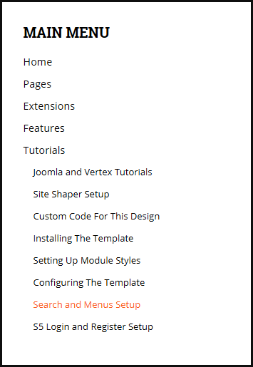
- Publish any menu module to the main body module positions on your site.
- There should be no menu style suffixes applied under advanced parameters.
- The menu style should be set to list.
3. Bottom Menu Setup

- Publish any menu to the 'bottom_menu' position.
- There are no menu style suffixes applied under advanced parameters.
- The menu style should be set to list
- Details
- Written by Super User
- Category: Demo Info
- Hits: 15251
Javascript Version
CSS Version Default

CSS Version 1
CSS Version 2

CSS Version 3
Example Slide
CSS Version 4
Example Slide
CSS Version 5
Example Title
Example Title

CSS Version 6
Example Title
Example Title
CSS Version 7
CSS Version 8
CSS Version 9
CSS Version 10
- Details
- Written by Super User
- Category: Demo Info
- Hits: 14627
- 01Download the installation package from our download section.
- 02Once the download is complete go to the backend of Joomla.
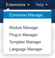
- 03Navigate through your menu system to Extensions/Extensions Manager.
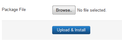
- 04Once at the installation screen click the browse button and navigate to where you downloaded the template file.
- 05Once you have the file selected click 'Upload File and Install'
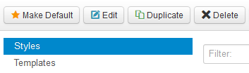
- 06Navigate through your menu system to Extensions/Template Manager.
- 07Find the radio button next to the newly installed template.
- 08Click on the Default button at the top right of the screen and you're done!
The template is now installed, now let's set it as the default template:
- Details
- Written by Super User
- Category: Demo Info
- Hits: 13920
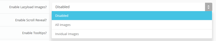
Setup is very easy! By default this script is disabled, in order to enable it simply choose All Images or Individual Images from the drop down, as shown below from inside the template configuration page.
All images will load every standard image on the page with lazy load. There is no extra configuration or extra code to add with this configuration, it will just happen automatically. Individual images would be used if you want only certain images to load with this script and not all of them. To do this simply add class="s5_lazyload" to the image like so:
This script is compatible with Firefox3+, IE8+, Chrome14+, Safari5.05+, Opera 11.11+
See the script in action:
- Details
- Written by Super User
- Category: Demo Info
- Hits: 5662
The S5 Box can be demo'd by clicking on either the Login button on this page.
The module allows for up to 10 different S5 Box's on one page all via 10 module positions. You simply add a class to any HTML element on your site and enable the corresponding box and you are good to go!
To enable the login and register modules:
- 01Install the S5 Box module and publish it to all pages on your site. Try to publish it to a position where a module already exists on all pages, but don't worry it won't change the layout of your site, the script is automatically hidden on your site.
- 02Install and publish the S5 Register module to the 'register' module position
- 03Publish the default Joomla login module to the 'login' module position.
- 04In your template parameters area of Joomla you can change the text for login, register and logout.
- 05That's it, you're all done!
If you do not wish to use the S5 Box but would still like to use the Login and Register links then simply complete step 4 above and also fill out your own custom urls just below those fields in the template configuration. Filling out the custom url fields will disable the S5 Box.
The S5 Box runs off of the core Joomla jquery/mootools libraries so there will be no conflicts with third party extensions or extra javascript files to download.
Features:
- Powered by no conflict mode jQuery Javascript or mootools
- Choose, elastic, fade or none for the popup effect
- Up to 10 S5 Box's throughout your site or on any one page!
- Set the percentage of width of each box according to overall screen size
Tutorial on how to get the s5 box working and use all 10 module positions it includes:
- 01Adding the S5 Box positions:
- Open up the templateDetails.xml file included with the template you are using.
- Locate the positions area.
- Start adding new positions s5_box1, s5_box2, s5_box3, etc all the way up to s5_box10.
- 02Adding the S5 Box classes:
- The S5 Box class name of the corresponding position must be added to the link that will open the box. For example the following code will display a link that says Click Here and will open the S5 Box and display whatever module is published to the s5_box3 module position:
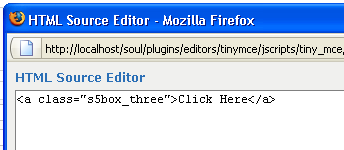
- These classes can be added to any element, ie: divs, spans, etc., but the common use will be to add this into content with a link similar to the one shown in the picture above. To enter this link you must do so from the HTML edit screen on your content editor:
Once you have clicked the HTML button the HTML code window will appear much like the first image. - You can continue adding these classes throughout your site just be sure to have published a module to the corresponding position or the box will not work correctly. So if you add the class s5box_two you will also have to publish a module to the s5_box2 position.
- Module positions and their corresponding classes:
s5_box1 = s5box_one
s5_box2 = s5box_two
s5_box3 = s5box_three
s5_box4 = s5box_four
s5_box5 = s5box_five
s5_box6 = s5box_six
s5_box7 = s5box_seven
s5_box8 = s5box_eight
s5_box9 = s5box_nine
s5_box10 = s5box_ten
- 03Lastly, publish your modules to the S5 Box positions:
- Now that you have added the s5 box positions just go to your site modules area and publish modules to those positions
- Make sure that you have added a class to an HTML element as described above or the s5 box will have no activation button
- Also make sure to publish the actual s5 box to a non s5 box position, perhaps publish it to the "debug" position or a similar one in your template.
Main S5 Box Module Settings:
- In the backend of the S5 Box module you can adjust the width of each box independent of each other.
- Make sure that the S5 Box module is published to all pages, it can be published to any template position. Also make sure that the module opening in the box is published to the page the link is on.